One sure thing about Blood Bowl is that if you start talking about race classification there will be inevitable debates about which team fits where. After watching yet another of these discussions around the standard bash/dash/hybrid distinction I decided to see if taking a data-driven approach could provide an interesting perspective. To do so, we’ll look at matches from a few different leagues to see if our results are consistent.
Leagues analysed
- REBBL - Seasons 5, 6 and 7 (PC league - 3896 games)
- OCC - All seasons (PC league - 3611 games)
- MML - Seasons 9, 10 and 11 (PS4 league - 4525 games)
- Champion Ladder - Season 12 (PC matchmaking league - sample of 4119 games)
These four leagues provide a good spread across platforms, league types and experience levels so should be a good test of the robustness of our findings.
league_data <- c("REBBL" = "REBBL_S567.rds", "OCC" = "OCC_All.rds", "MML" = "MML_S91011.rds", "CCL XII" = "CCL_XII.rds")

read_and_clean <- function(path) {
  readRDS(str_c(data_dir, path)) %>%
    map_dfr(
      ~.x$teams %>% # .x$teams stores the statistics for the match
        map_dfr(
          ~purrr::flatten(.x) %>%
            purrr::modify_if(is.null, ~NA) %>%
            as_data_frame()
        )
    ) %>%
    filter(mvp == 1) # only want completed games
}

data_tables <- map(league_data, read_and_clean)
Selecting data
Since this analysis is limited by the data that goes into it, it’s worth considering precicely what data will be used. A lot of data is collected for a team each match including information about the state of the team (TV, Fan Factor, #rerolls, etc.) as well as the match performance (score, #blocks, #kills, etc.). Taking the usable1 performance statistics gives us the following to work with:
select_stats <- function(df) {
  df %>%
    mutate(race = id_to_race(idraces)) %>% # race names rather than idcodes
    select(
      race,
      occupationown:sustaineddead,
      -mvp,
      -inflictedpushouts, # always zero, so uninformative
      -inflictedcatches # passes/catches are duplicates so only keep one
      )
}

data_tables <- map(data_tables, select_stats)

data_tables$REBBL %>% colnames()
## [1] "race" "occupationown"
## [3] "occupationtheir" "inflictedpasses"
## [5] "inflictedinterceptions" "inflictedtouchdowns"
## [7] "inflictedcasualties" "inflictedtackles"
## [9] "inflictedko" "inflictedinjuries"
## [11] "inflicteddead" "inflictedmetersrunning"
## [13] "inflictedmeterspassing" "sustainedexpulsions"
## [15] "sustainedcasualties" "sustainedko"
## [17] "sustainedinjuries" "sustaineddead"Obviously these don’t cover the full spectrum of things that occur during a match, but do provide a good mix to look at.
Analysis
We will be using Principal Component Analysis to take a basic look at how the data break down. An excellent visual introduction to PCA con be found here, but essentially we transform the 17 statistics for each match into a coordinate system that explains most of the variation in values.
run_pca <- function(df) {
  df %>%
    select(-race) %>%
    as.matrix() %>%
    prcomp(scale = T)
}

PCAs <- map(data_tables, run_pca)
The first two principal components for each league explain around 37% of the variation in match statistics. Not an overly impressive amount, however there will be a lot of noise in the data due to the large reliance on random dice rolls in a match. Taking a look at how the matches can be plotted across these two components for an individual league, we see that it is a little bit of a mess:
cbind(as_data_frame(PCAs$REBBL$x), race = data_tables$REBBL$race) %>%
  ggplot(aes(x = PC1, y = PC2, colour = factor(race) %>% fct_reorder2(PC1, PC2, sum))) +
  geom_point(alpha = 0.5) +
  theme(legend.position = "none") +
  ggtitle("PCA", "REBBL S5, S6 & S7")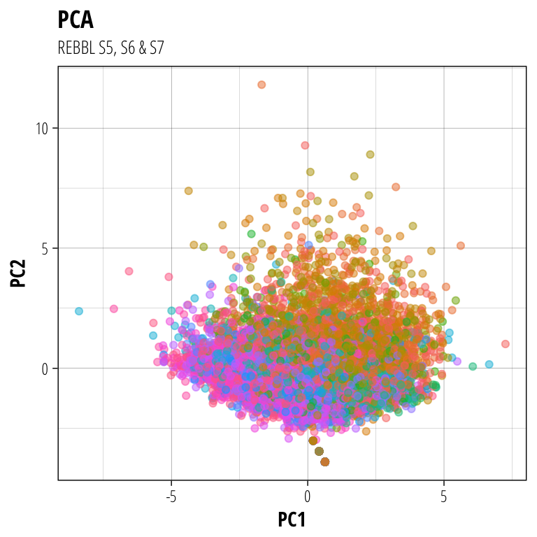
Each point on this plot is a single team’s statistics for a match (3896 games - 7792 points) coloured by the race of the team. While there is clearly a lot of variation in how individual matches finish up, there does seem to be a clear trend in certain races clustering to certain parts of the graph. We can summarise this by just taking the median coordinates for each race.
plot_pca <- function(pca, data, flip_x = 1, league) {
cbind(data.frame(pca$x), race = data$race) %>%
group_by(race) %>%
summarise(PC1 = median(PC1)*flip_x, PC2 = median(PC2), count = n()) %>%
ggplot(aes(PC1, PC2, label = race, colour = factor(race) %>% forcats::fct_reorder2(PC1,PC2,sum))) +
geom_point(aes(size = count), alpha = 0.4) +
ggrepel::geom_text_repel(size = 3, point.padding = unit(0.05,"lines")) +
theme(legend.position = "none") +
ggtitle(league) +
scale_x_continuous(expand = c(0.2,0))+
scale_y_continuous(expand = c(0.2,0))
}
plots = pmap(list(PCAs, data_tables, flip_x = c(1,-1,-1,1), names(league_data)), plot_pca)
plot_grid(plotlist = plots)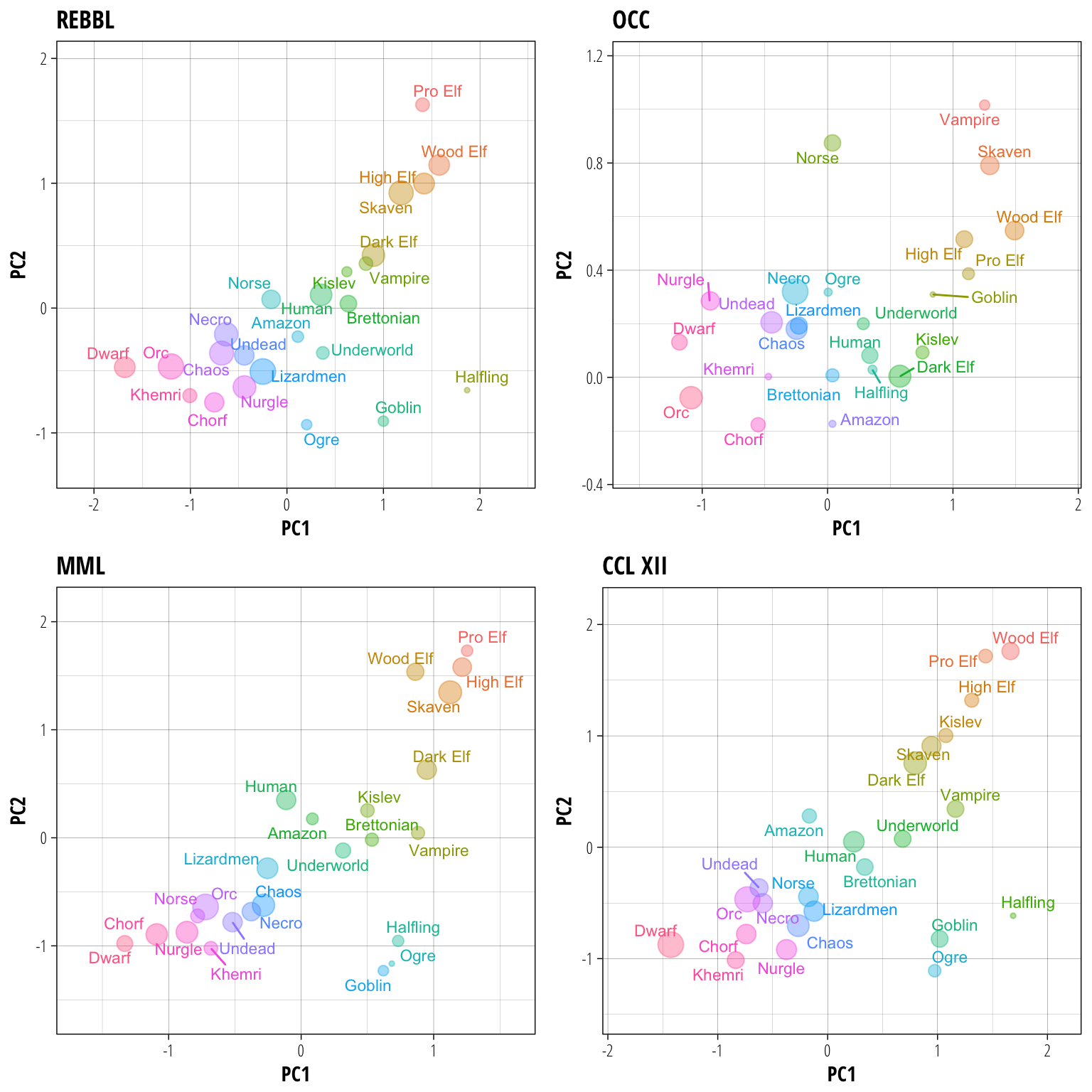 In this case we have also scaled the size of the points to be proportional to the number of games a race has played in each league, to get some idea of the popularity of each race as well.
Some initial impressions from looking at these results:
- REBBL, MML and CCL all have relatively similar patterns while I have no idea what they’re putting in the water over at OCC to get such a weird relationship (stunty teams mixed in with the regular ones?).
- The distribution of teams maps pretty well onto the usual bash/dash/hybrid definition, with a few interesting differences.
- The races exist along a spectrum, rather than in distinct clusters, which explains why there might be disagreements about how some of the trickier teams could be classified.
Despite this spectrum making an hard classification essentially arbitrary, how would you group races based on this analysis? My attempt to do so would be as follows:
The beautiful game
- High Elf
- Wood Elf
- Pro Elf
- Skaven
With lots of passing and running, these are the teams to look for when composing highlight reels. All four cluster closely together in REBBL, MML, and OCC with a slight overlap with the next group in CCL.
Slippery customers
- Dark Elf
- Vampire
- Kislev
Not as focussed on theatrics as the previous teams, these three play more of a steady running game and try to limit attrition. In a tight squeeze however, they will all fall back on some AG4 action to save the day. This grouping is best seen in REBBL, however can be observed in MML and CCL as well.
No racial modifiers
- Human
- Brettonian
- Amazon
- Underworld
- Norse
The ‘human zone’ of teams that are flexible enough to adopt many different playstyles. These teams cluster around the (0,0) point on each graph, meaning that their match statistics are going to be close to the average across all races. Norse are a partial inclusion in this list because in some leagues they perform more like Humans (REBBL, OCC), while in others (MML, CCL) they fall into the next grouping.
Give and take
- Norse
- Lizardmen
- Necromantic
- Chaos
- Undead
- Orc
- Nurgle
The bashier hybrid teams start here, with these group starting to cause an above average number of injuries each match. They do not fully commit to the bash lifestyle however, either being fragile enough that they take their fair share of injuries as well or turning a small player advantage into scoreboard pressure rather than an even larger player advantage. Again, we have some partial inclusions in this group because both Orcs (MML, CCL) and Nurgle (REBBL, CCL) cluster here in some leagues and in the next group in the others.
Take no prisoners
- Orc
- Nurgle
- Dwarf
- Chaos Dwarf
- Khemri
For the teams in this group, the only safe touchdown is one where there are no opposition players left on the pitch. Lots of injuries caused and very few sustained will cause a team to end up in this category, with Khemri and both flavours of Dwarf the permanent members and Orcs/Nurgle situational inclusions depending on the league meta.
It’s an honour to be nominated
- Ogre
- Goblin
- Halfling
Not surprising anyone, the stunty teams all cluster together away from the rest of the races (ignoring the OCC). More specifically, they cluster in a region of the graph that suggests they are worse at scoring touchdowns than the other teams. Interestingly, in MML the Goblins appear to be slightly ‘bashier’ than the Ogres, however this may just be becasuse of the low number of Ogre teams in the league.
Final thoughts
Even though this analysis is pretty basic, we have been able to create a data-driven classification of Blood Bowl races based on team performance. This classification is generally consistent with those created based on other characteristics, with the added benefit of being able to identify races that play differently from expectations within a specific league environment. This could be due to unique team builds or playstyles adopted by coaches within the league.
If anyone has any insights from within these leagues as to why specific races might look out of the ordinary I’d be glad to hear them. Or if you think there’s a better grouping of teams based on the above graphs let me know below.
Currently, the API from Cyanide does not record crowdsurfs in the aggregate team statistics, despite recording them correctly in the individual player stats↩
Share this post
Twitter
Google+
Facebook
Reddit
LinkedIn
StumbleUpon
Email